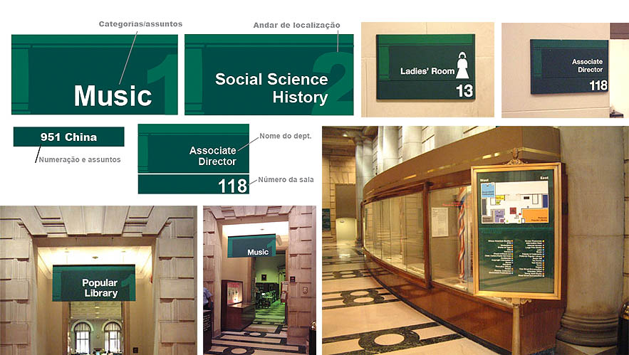
The FREE Library of Philadelphia was developing a new logo and hired us to develop a parallel project of information architecture and signage to help visitors easily self locate themselves and find sections of their interest. The project helps visitors perceive cognitively which floor they are and the closest options for mobility and search. The design of the visual information resulted in different sizes and structure, taking on account the needs of visitors and variety of search distances: from up close to 50 meters.
Since the new identity was not finished and the signage had urgency, the information visual identity was based of the Library's architecture structure, which could persist to any new logo development.
Client: The Free Library of Philadelphia Project: Sinalização interna